Monday, August 29, 2011

Aqumin Volatility Newsletter 08/26/2011 $BAC, $HPQ, $JPM

“You were always on my mind…..”

Ah the sweet sounds of Willie Nelson. Not so sweet is the mess we have following the S&P Downgrade of US Sovereign Debt. After a one week layoff in posting, although I do look at the market every day, there is plenty to look at in the aftermath of the downgrade. I am going to call this G7 (lump in the USA now) Debt problem, for however long it lasts, the New New Era. As opposed to the New Deal which saw a contraction of credit (after the Crash of 1929) and expansion of fiscal stimulus, we have an expansion of credit and fiscal stimulus. The New Deal was not kind to stocks, but great for government bonds as the real yields plunged to negative numbers (sound familiar?). The difference is after the 2008 Crisis we got lots of credit through TARP and various monetary pops from the Fed. No doubt Fed policy makers learned from The Depression to keep the money taps open. I think the problem now is Europe did not go through the serious bloodletting that the USA did in 2008. Besides the US debt downgrade, not much has changed in the last 3 weeks or so (not that the debt ceiling resolution or other economic news has been that great). Let’s examine 10 Day Realized Volatility during the era of New New to see what we can see.

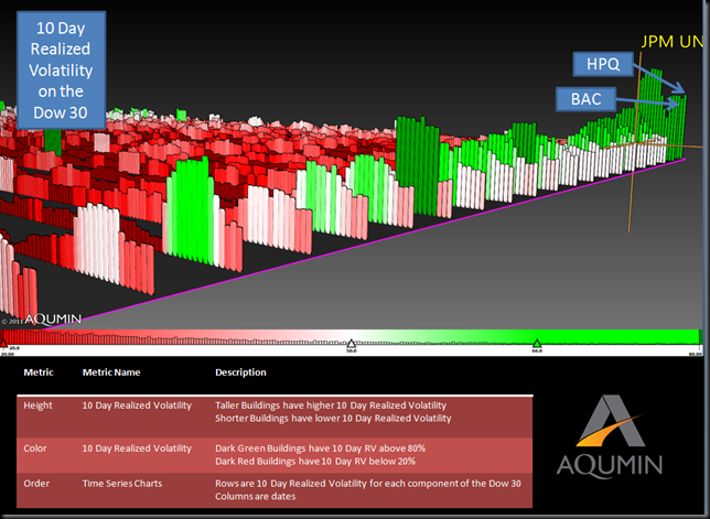
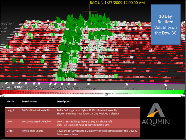
First here is a short primer on the Financial Crisis of 2008 and 10 Day Realized Volatility. In the Aqumin Time Series Landscape below the Dow Jones Industrials are laid out like standard bar charts side by side to read an actual volatility impression of the market. Time is moving from January of 2008 on the left to today (just out of sight). It is easy to pick out outlier patterns like this. Dark Green bars are over 80% Realized Volatility for the previous 10 Days. White is near 50% and Dark Red is below 20%. The Financial Crisis in 2008 is pretty easy to spot. Note that it was really two, 3 month periods of extended volatility. BAC topped out at about 311% 10 Day Realized Volatility when things got really nasty.

 8-29-2011 9-22-36 AM

Also note how Realized Volatility collapsed as the financial crisis tailed off. Stocks stopped moving while market participants scratched their heads as to what was going on. The next phase of the New New Era is last summer’s meltdown from Greece and other higher risk nations in the Euro Area.

 8-29-2011 9-24-45 AM

I have a Money Center bank like JPM topping out around 56.45% for a 10 Day Realized Volatility. If you note the Dark Red area just to the left of the JPM flag, 10 Day Realized Volatility was very low and that Euro Crisis was about a double on average for the 2 month span of higher numbers. The Euro band aid and QE2 seemed to hold things together as volatility in the Dow receded a bit.

Now we get the S&P shocker below which I believe added the US officially to Sovereign Debt pile in people’s minds. Notice the giant spike in 10 Day Realized Volatility as the market literally melted. Stocks might climb a wall of worry but they fall off a cliff in a panic. As of today we are about 50% off of the 10 Day Realized Volatility highs of early August but near the same level as the peak last summer as you look across the DJIA stocks. Just compare the relative levels now with the picture above. I have JPM highlighted at around 47.735 10 Day Realized Volatility. Also note the last few days as most of the building are inching back up. The leader in the corner is HPQ (after trying to get out of the personal computer business and feels a lot like IBM in the early 1990’s) and next comes BAC. BAC now has the Berkshire Hathaway put going, and while I can’t pretend to know how Mr. Buffet operates, that BAC Preferred Stock purchase might be a subtle way of Warren telling the President, “Leave the banks alone, we still need them!”

 8-29-2011 9-26-11 AM

Now back to Willie’s song, You were always on my mind. The market volatility is coming from policy problems the G7 governments can’t seem to fix, which is how I read this Time Series Landscape. The tools are there but the politics and problems linger and having the USA tossed into the mess brought things from the back of the mind to the sell button. JPM seems to have slowed down a bit and is trading well under the 10 Day Realized Volatility of last summer. I think a little less relative volatility means a more stable outlook and you might want to selectively sell, controlled long bias type option premium in there. HPQ will have a hard time seeing 10 Day Volatility get much higher than it is right now and you can trade that accordingly. BAC has the Buffet put on so it is probably not going out of business even though the market priced it that way 5 days ago.

Sovereign Debt worries are on my mind, so I don’t do anything that big and wait for the next shoe to drop in our New New Era.
Tuesday, August 9, 2011

Aqumin Volatility Newsletter 08/09/2011 - $CAT, $BAC, $MCD

Put a Collar on your CAT

As I write this volatility report, I realize the Equity Markets have had what psychologist must dub a Nervous Breakdown. Where things were already on a knife edge and some event comes along and the mind falls apart. I view the S&P downgrade as something like that. There was thin confidence in governments of late and now someone said they need to get their act together. This was a surprise? Imagine if S&P did this in 2006 with Mortgage Backed Securities? Congressmen would have screamed at them for killing the American Homeowners dream. Either way, Sovereign Governments will have to spend less (or better collect revenue) because economies only generate so many dollars. The Politicians should thank S&P for giving them cover to do the
$1 Trillion per year in cuts that is needed. The change in spending alone will give the patient (market) the confidence it needs to get rolling again.

So what did this do to market Implied Volatility? It went through the roof and you don’t need a 3D Landscape to tell you that. When the S&P 500 moves at 5% per day, the VIX is going to soar and stocks are going to move in lockstep. So let’s go back in time to 2 or so weeks ago, prior to the breakdown and perform some hypnotherapy on the Dow and see what we see.

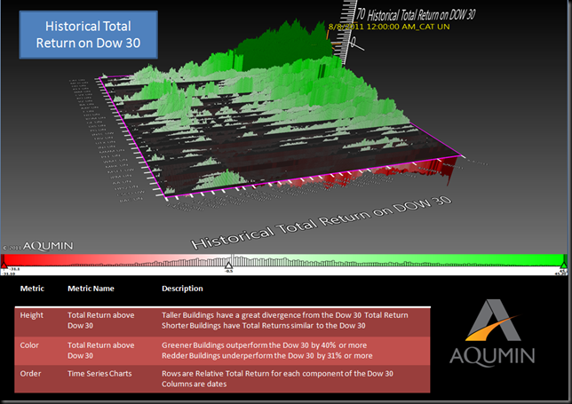
Anyone with a Bloomberg Terminal or a decent downloadable data feed can run AlphaVision™ for Excel. This chart setup is an expanded Time Series unique to Aqumin and provides a new way to chart market data. I have loaded the Dow 30 stocks in rows and measured the relative performance of each name. The Green Spikes are a 45% over performance and the Dark Red spikes are 30% underperformance. The rows are ordered by the relative performance starting from best (to worst). The best was CAT and the worst was BAC.

8-9-2011 9-42-39 AM

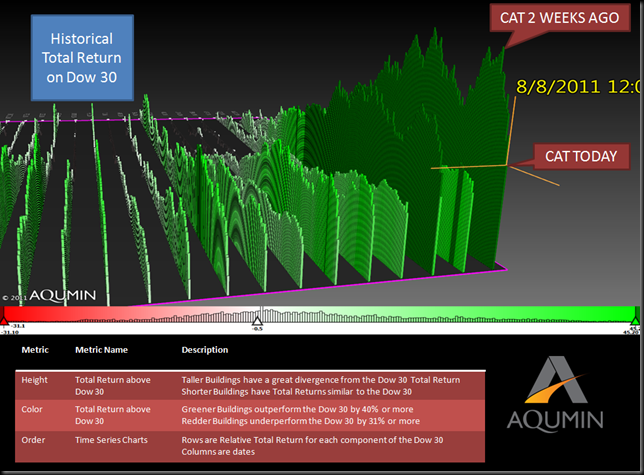
At this point you say big deal. I can see that in my Dow spreadsheet. Even if you did not know CAT was the Dow leader this year, BAC is not much of a surprise (it does look like capitulation now). However, with Aqumin’s 3D landscapes you can spin the charts around and get a new view below. The view now is definitely not how market participants can look at charts. You can see the last 2 weeks of all the charts at once. CAT is moving back very quickly to the pack even if the story has not changed. That is the market selling everything and possibly the best holdings more to raise cash.

8-9-2011 9-23-33 AM

CAT road the global growth story best all year since it sells the trucks that mine everything hungry emerging economies want. Its fall has been stunning (on an absolute basis) and the market is quickly relegating it to look like all the other names in the Dow. The relative performance is almost back to MCD (#2). Things are a little to fresh to just go out and buy the name. But CAT, properly fitted with a 3 month+ out option collar looks like a way to run when the name resumes with a bolt. The outperformer once will be the outperformer again and an option collar adds a trading piece should things get uglier in the short term.

Thursday, August 4, 2011

Aqumin Volatility Newsletter 08/04/2011$GLD $GDX $NEM $ABX $NGD $KGC $AEM $BHP $FCX $IAG

The big Debt Crisis ended with a thud. Now it is up to a committee and the next election to decide if spending 8% or so of GDP on yearly deficit is a good idea. I will leave that for the pundits and voters to decide. What happened in the equity and volatility markets gave a more telling vote. The stocks sold off and VIX increased since my last post from 20.55 to 23.38. The worries are more about the economy and possible recession even with corporate profits (and global growth) currently very strong. Really just bad sentiment and uncertainty that is driving the market and the debt vote did little to change that. Since AlphaVision for Bloomberg has a historical function I thought it would be instructive to compare my last post to the volatility pricing on the close of August 3rd.

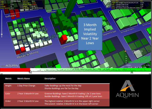
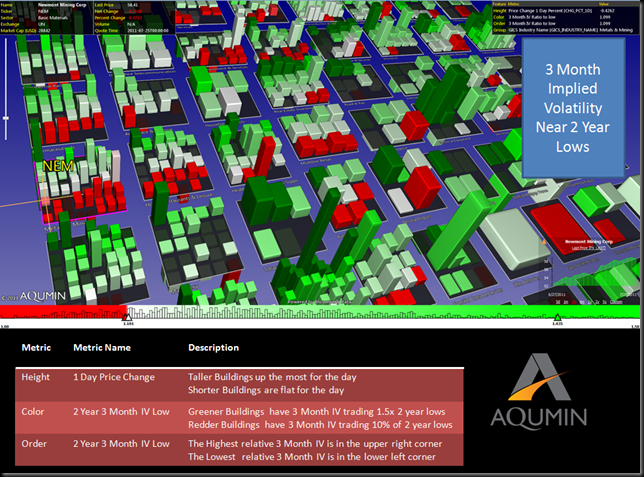
First as a review, last week I looked at 3 month Implied Volatility (IV) relative to 2 year lows (for color and position). If the building is red and at the bottom of each GICS Industry plate, the names are within 10% of 2 years lows (for the 3 month IV) and lowest relative for the group. I use height for 1 Day Price Change to isolate any gaps from the volatility read. I thought the Gold Stock (highlighted) volatility looked too cheap to me last week.

8-4-2011 9-00-39 AM

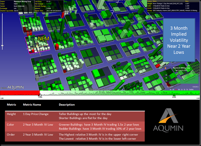
Now take a look at the same landscape this morning.

8-4-2011 9-02-54 AM

This is the nice thing about using visual cues in a landscape. The Gold Stock group that I have been following is less red (we were right from last week’s post) so the 3 month Implied Volatility has popped a bit. Also all the Gold Names became more bunched at the bottom from last week too which means they are staying closer to their 3 month Implied Volatility lows relative to the rest of the group (although not as low as before). It appears the market is relegating these names to the bottom of the volatility (less uncertainty about direction which I take to mean gold is not falling off a cliff any time soon) heap even as gold makes new highs.


I also had a broad quoted landscape of the volatility market last week (same view as above but panned out).

8-4-2011 9-04-42 AM

Notice there was a lot of red in it. Even going into the Debt Crisis vote plenty of names were trading within 10% of 3 month Implied Volatility 2 year lows. Now look at the close yesterday and what do you see?

8-4-2011 9-06-08 AM

Where did all the red go? Save for 10 or so names most of the 3 month Implied Volatility in equity market is well off their 2 year lows and much of it is 50% higher (dark green). After the Debt Vote, the 3 month Implied Volatility is higher in individual names then before which does not make sense to me. Yes we had a slide down but on balance the uncertainties have declined slightly (at least in the US). The Volatility market is not buying it for now so I will sit on the Gold Premium and start looking to sell some of the expanding volatilities in the ETF’s as opportunity and pricing permits. These sentiment driven markets can change in a hurry.

From last week- “the GLD and GDX ETFS’ are trading 19% and 14% of 3 Month Implied Volatility two year lows.”

The print from this week- the GLD and GDX ETFS’ are trading 26% and 20% of 3 Month Implied Volatility two year lows so we got a nice little move up in 3 month IV but not as much as the market overall.